Close-up of a high-resolution monitor displaying a dark-themed UI design system — component panels, typography scales, and grid overlays visible on screen. Cool blue monitor glow illuminates a mechanical keyboard in the foreground. Shot from a 45-degree angle, shallow depth of field, no people.
/ Diseño Web

Construido desde cero. Sin temas, sin atajos.

Cada sitio nace de un brief real, no de una plantilla reutilizada. Código limpio, arquitectura propia, resultado que sigue funcionando en tres años.

Wide shot of a design software canvas open on a large monitor — wireframes and high-fidelity mockups side by side, cursor mid-drag on a component. Ambient cool-white room light, no warm tones. Desk environment visible in soft focus behind the screen.
Extreme close-up of hands typing on a backlit mechanical keyboard, code editor visible on a dark screen in the background — syntax-highlighted CSS and JavaScript partially visible. Cool studio light from the left, motion blur on fingertips suggesting active work.
Smartphone held in hand displaying a fast-loading dashboard interface — performance metrics panel visible on screen, browser dev-tools open on a laptop in the background showing a 98 Lighthouse score. Cool daylight from a window, no warm tones, documentation-style framing.
— Cómo lo hacemos

Ves el resultado antes de que lo construyamos.

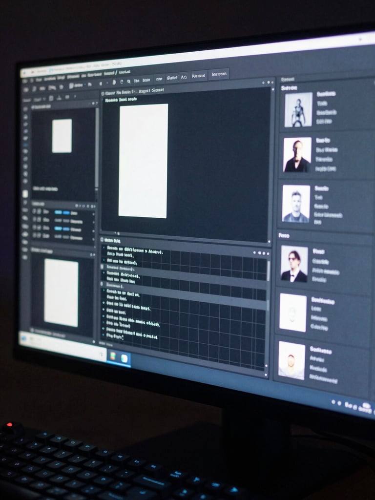
01 — Dirección de diseño primero

El primer entregable es una dirección visual completa: paleta, tipografía, composición de pantalla clave. Lo apruebas antes de que escribamos una línea de código.

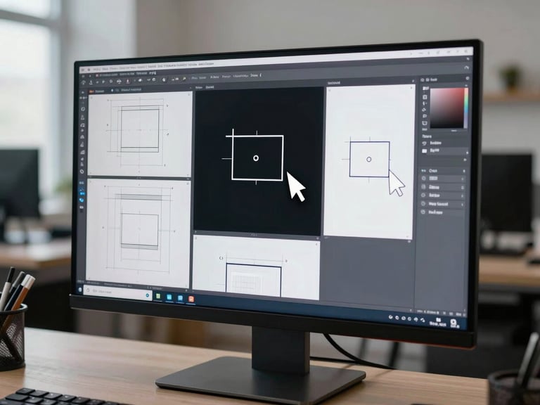
02 — Desarrollo a medida

Código propio sobre arquitectura escalable. Sin constructores de páginas, sin UI kits prestados. Cada componente responde al brief, no a un tema genérico.

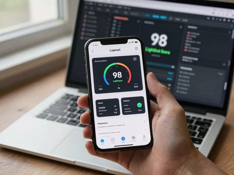
03 — Listo para operar desde el día uno

Mobile-first, SEO estructurado y performance optimizado son condiciones de entrega, no extras. El sitio ya está listo para escalar cuando llega a tus manos.

SEO Day 1

3 semanas

100%

< 2 s

Desarrollos a medida. Ningún proyecto parte de una plantilla comercial.

Tiempo de carga objetivo en todos los sitios que entregamos.

Estructura semántica y metadatos configurados antes de la primera publicación.

Plazo promedio de entrega para sitios corporativos completos.

¿Tu próximo sitio debería verse como este?

Cuéntanos el proyecto. En 24 horas tienes una dirección visual inicial, no una propuesta genérica.